School Logo

The symmetry of the logo symbolises the **balance of a holistic education for all**. It features three orange shapes that resemble the bloom of petals. Collectively, they represent the school’s desire to **nurture students who flourish as Competent Learners, Confident Leaders and Caring Innovators**.
The **three segments** also suggest seeds beginning to burst open with energy and life, expressing optimism in growing people and nurturing aspirations. They reflect the belief that an open mind and a willingness to seek new experiences, ensures that students learn, thrive and make a difference. In this way the three seeds echo the key words of the school’s enduring motto of **Pursuit, Knowledge, and Service**.
A strong **“Y”** in the centre not only stands for Yio Chu Kang Secondary School, but also suggests a tree trunk with branches pointing skyward in **open embrace of learning and service to others**.
The **circle** that brings all the elements together forms a never ending ring to symbolise the **collaborative synergy of staff, students and the community** working together in a spirit of inclusivity.
**Extra Information below**
-
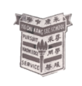
In the beginning – The Shield Design
The first school logo was introduced when the school was established in 1965 by the founding Principal, Mr Cyril Jensen. The badge was white and brown.
Interpretation (1965-1981)
* Shaped to resemble a shield, the logo carries the words Pursuit, Knowledge, and Service in English and in Chinese. These words represent the school’s desire for students to continually improve themselves, to utilize their spare time to enrich their knowledge and put their skill to good practice and be useful citizens.
* A prominent feature of the badge is a burning torch glowing with three full fingers of flame, expressing the enduring and inspiring nature of the three ideals of Pursuit, Knowledge, and Service.
* The school name is also written in both languages to indicate that it is an English-Chinese stream school. -

A new design was introduced by Principal Mdm So Bie Leng to mark the transition of the school to its new premises in Ang Mo Kio. It celebrates the transformation story of a rural school to a large campus with contemporary and full facilities. It also reflects the core ideas of the school motto, which was not changed.
Interpretation (1982-2017)
* The school logo is symbolised by a generator surrounded by a circle. The core of the generator is the letter Y which stands for Yio Chu Kang Secondary School
* The generator consists of three components and these symbolise pursuit, knowledge, and service. They also represent the students, the staff and the stakeholders, and their inter-connection pushes the school to excel.
* The circle symbolises the bond between the students and the management and the teaching staff of the school. Together they make the generator functional so that the students can be inspired to pursue knowledge and equip themselves to be useful citizens to serve the nation. -
Chong Boon Secondary School was established in 1994. The school crest, introduced by founding Principal Mrs Cecilia Lee, featured a golden flaming tree set in a brown background. It displays the values of Compassion, Benevolence and Steadfastness, which form an acronym that resembles the school's name, CBS.
Interpretation (1994-2005)
* The towering and prolific tree symbolises success in one’s undertaking.
* The flaming branches are the academic, moral, social and physical areas that the school aims to excel in. The roots remind students to learn to share and care, and to be courageous and tenacious in upholding integrity amidst change and transience.
* Thus students are guided with a firm hand and yet are given liberty to discover for themselves, and about themselves, so that they grow to be unique and distinct personalities, capable of independent thought and expression, and equipped for the world of work.
-
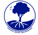
In 2006, the school adopted the metaphor of "Chong Boon, Our Garden of Growth" and a new school emblem. Subsequently, the school's programmes lead to efforts in developing environmental education. In 2009, the school became the first to be conferred niche status in Environmental Education. Through its continued commitment and national achievements in this field, the school developed this niche into its distinctive Applied Learning Programme in Sustainable Technologies. The school logo reflects this deep inclination of the school in environmental causes.
Interpretation (2006 – 2017)
* The school logo features a circle containing a silhouette, in dark blue and white, of a tree with prominent roots and two birds flying in the sky. The circular shape symbolises the desire to nurture students to be gracious all-rounders. The flow of the horizon reflects the ease that students feel in embracing a holistic education.
* The roots branch out in five directions symbolising the core values of Perseverance, Respect, Integrity, Dedication, and Excellence (PRIDE). The roots are the foundation for the tree to grow and flourish. The tree reaching towards the sky symbolises the students acquiring social and emotional competencies and maximising their potential in whatever they do.
* The birds flying in the sky represent the creative and entrepreneurial spirit. They represent our students going beyond the school and its curriculum to venture into uncharted territories in their pursuit of lifelong learning. With moral courage, confidence and resilience, they will go the extra mile to serve the nation.
-

In 2018, Chong Boon Secondary School and Yio Chu Kang Secondary School merged. The existing YCKSS logo was retained but given a new interpretation to incorporate elements of the CBSS logo. A key part of the reinterpretation is the adoption of metaphors related to nature in the CBSS concept. In this way, the merged school draws reference to a feature of the CBSS identity, environmental education.


